The Portland Inn Project
The Portland Inn Project
The Portland Inn Project
The Portland Inn Project
The Portland Inn Project
Creative in the Community
Creative in the Community
Creative in the Community
Creative in the Community
Creative in the Community

Web Design
Creative Workshops
Digital Design
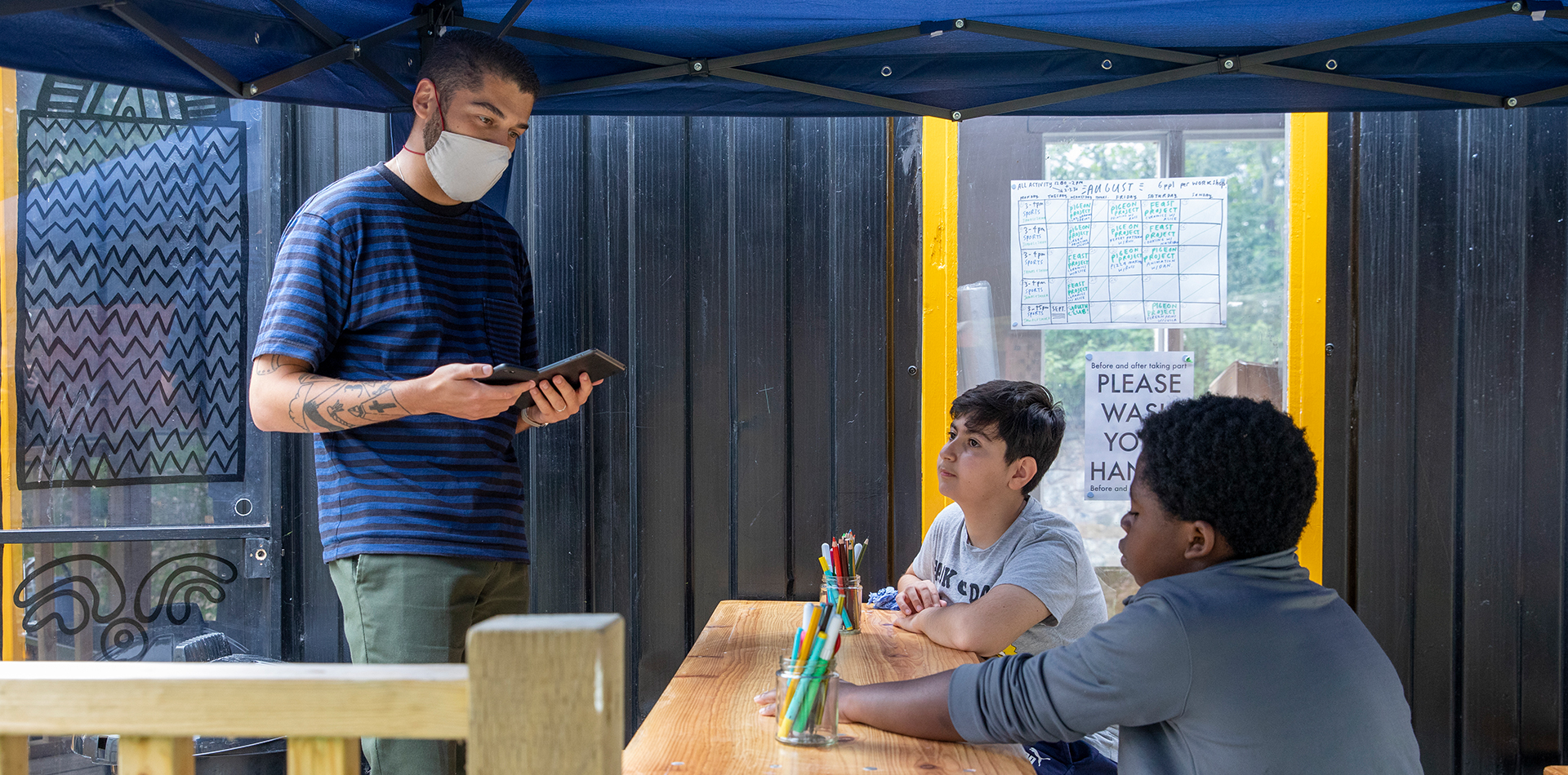
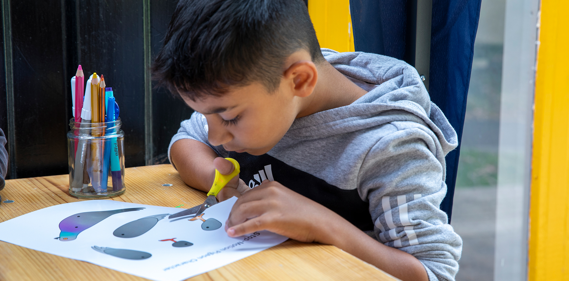
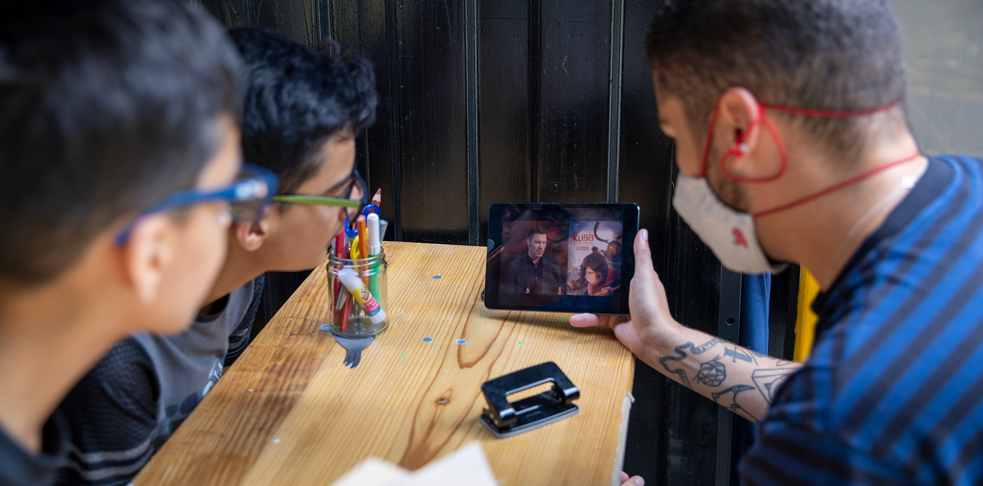
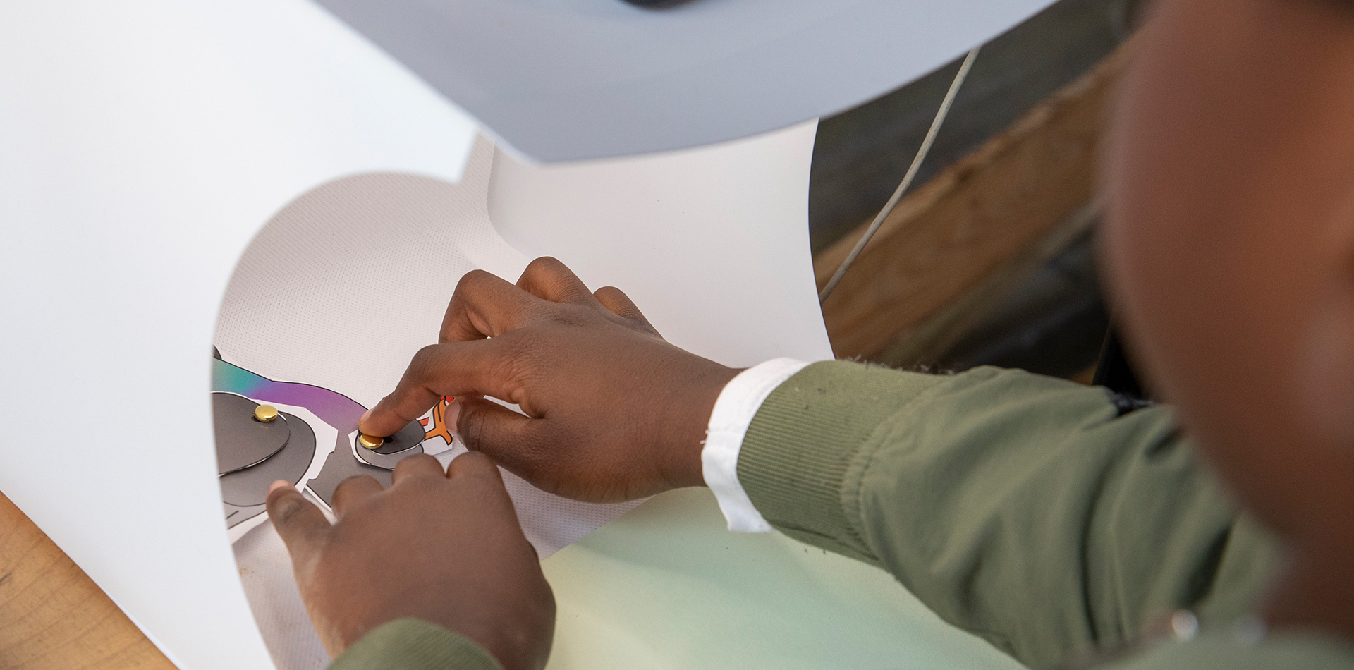
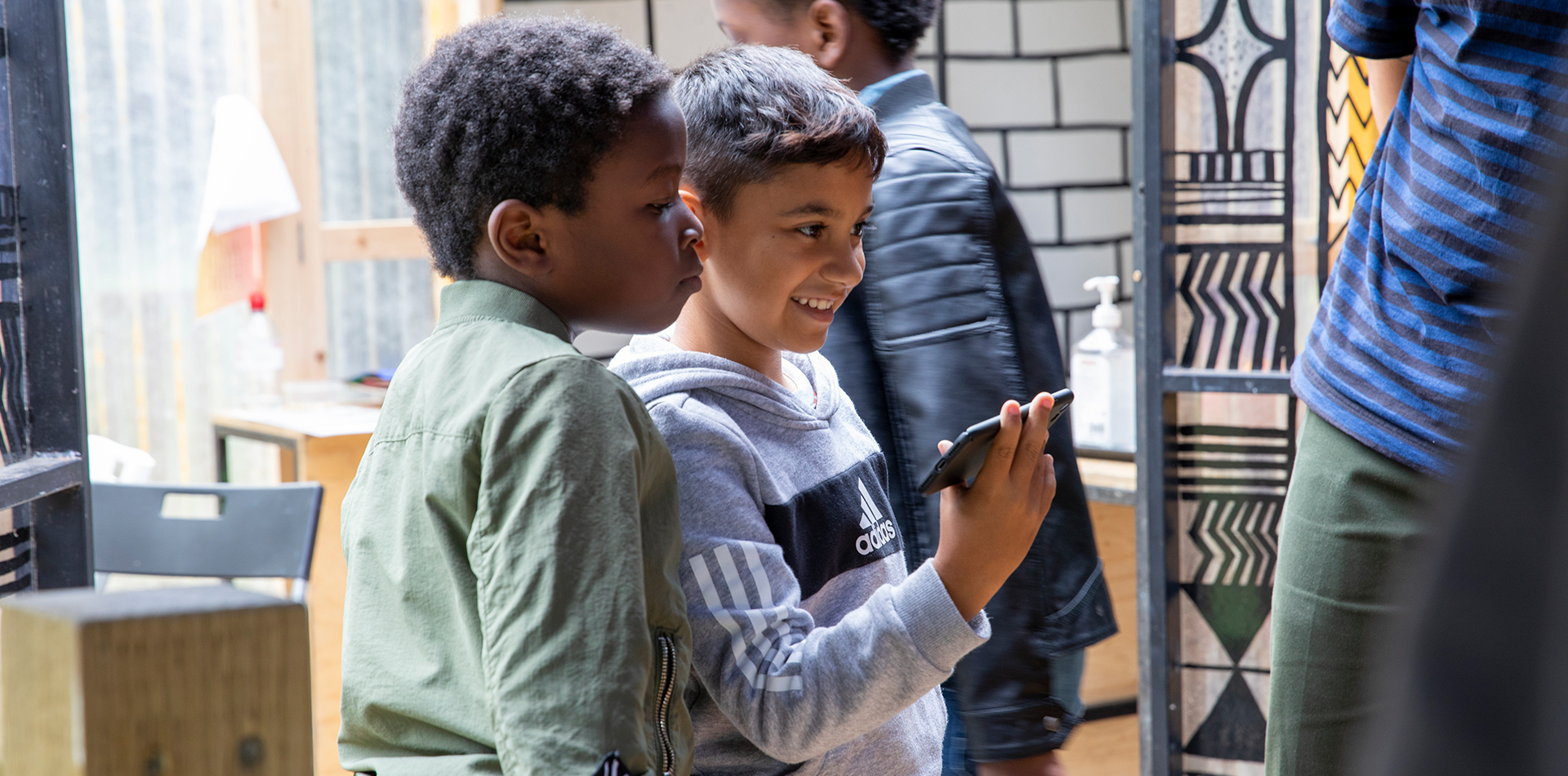
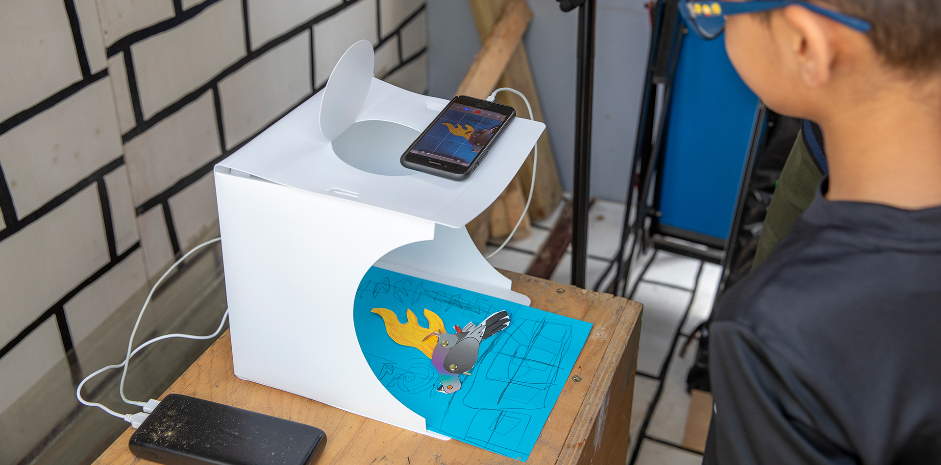
I started collaborating with the Portland Inn Project in 2020, where I delivered my first creative workshop on stop-motion animation with small groups of children, aged 5 to 13. We created a range of short videos, each telling a story using the project’s pigeon mascot. The following summer, as part of their summer programme, I got the group involved in a DJ workshop.
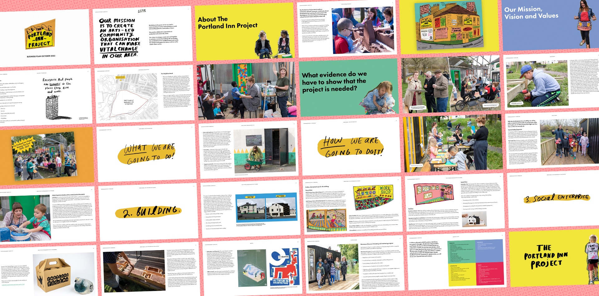
With project leads, Rebecca and Anna, we’ve continued to work together on their ever-evolving business plan, used to bid for funding for the project's main aim of turning the old and disused local pub, The Portland Inn, into a functioning community building.
Photography by Glen Stoker.
Lymelight Festival is an annual celebration of the local music scene of Newcastle under Lyme and the surrounding areas. The NUL BID team wanted me to give the event a more contemporary style, to re-engage with patrons and artists in their second event after the pandemic.
Tasked with creating a new brand aesthetic that appealed to a teen & young adult demographic, I created a hand-drawn psychedelic-style logomark, that lent itself perfectly to wavy animated applications alongside an electric, almost clashy, colour palette to grab viewers' attention in both digital and print media. For the rollout of the brand, I created a launch video, line-up posters and digital assets, printed banners, and staff t-shirts.
I started collaborating with the Portland Inn Project in 2020, where I delivered my first creative workshop on stop-motion animation with small groups of children, aged 5 to 13. We created a range of short videos, each telling a story using the project’s pigeon mascot. I’ve also since worked with the group on DJing workshops for the kids as part of a summer programme.
With project leads, Rebecca and Anna, we’ve continued to work together on their ever-evolving business plan, used to bid for funding for the project's main aim of turning the old and disused local pub, The Portland Inn, into a functioning community building.
Photography by Glen Stoker.
Web Design | Creative Workshops | Digital Design
I started collaborating with the Portland Inn Project in 2020, where I delivered my first creative workshop on stop-motion animation with small groups of children, aged 5 to 13. We created a range of short videos, each telling a story using the project’s pigeon mascot. The following summer, as part of their summer programme, I got the group involved in a DJ workshop.
With project leads, Rebecca and Anna, we’ve continued to work together on their ever-evolving business plan, used to bid for funding for the project's main aim of turning the old and disused local pub, The Portland Inn, into a functioning community building.
Photography by Glen Stoker.


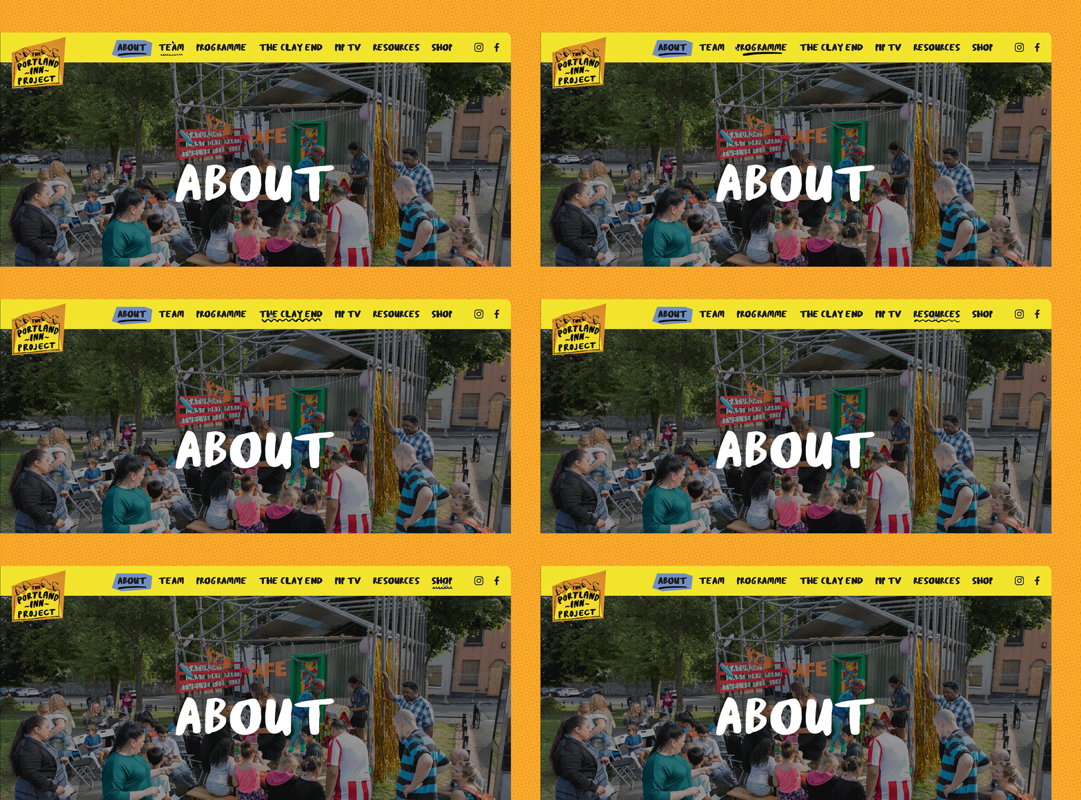
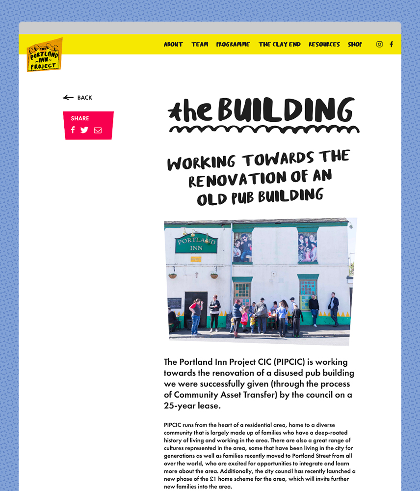
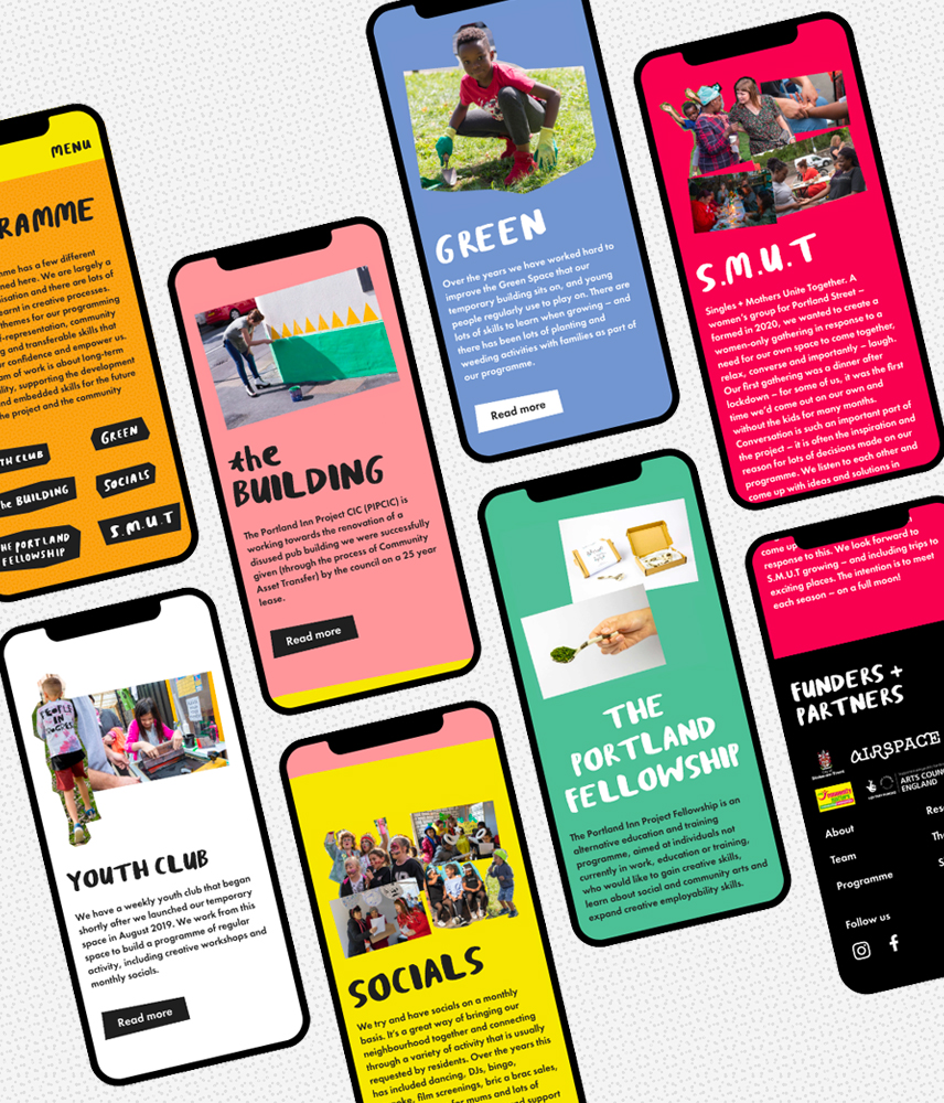
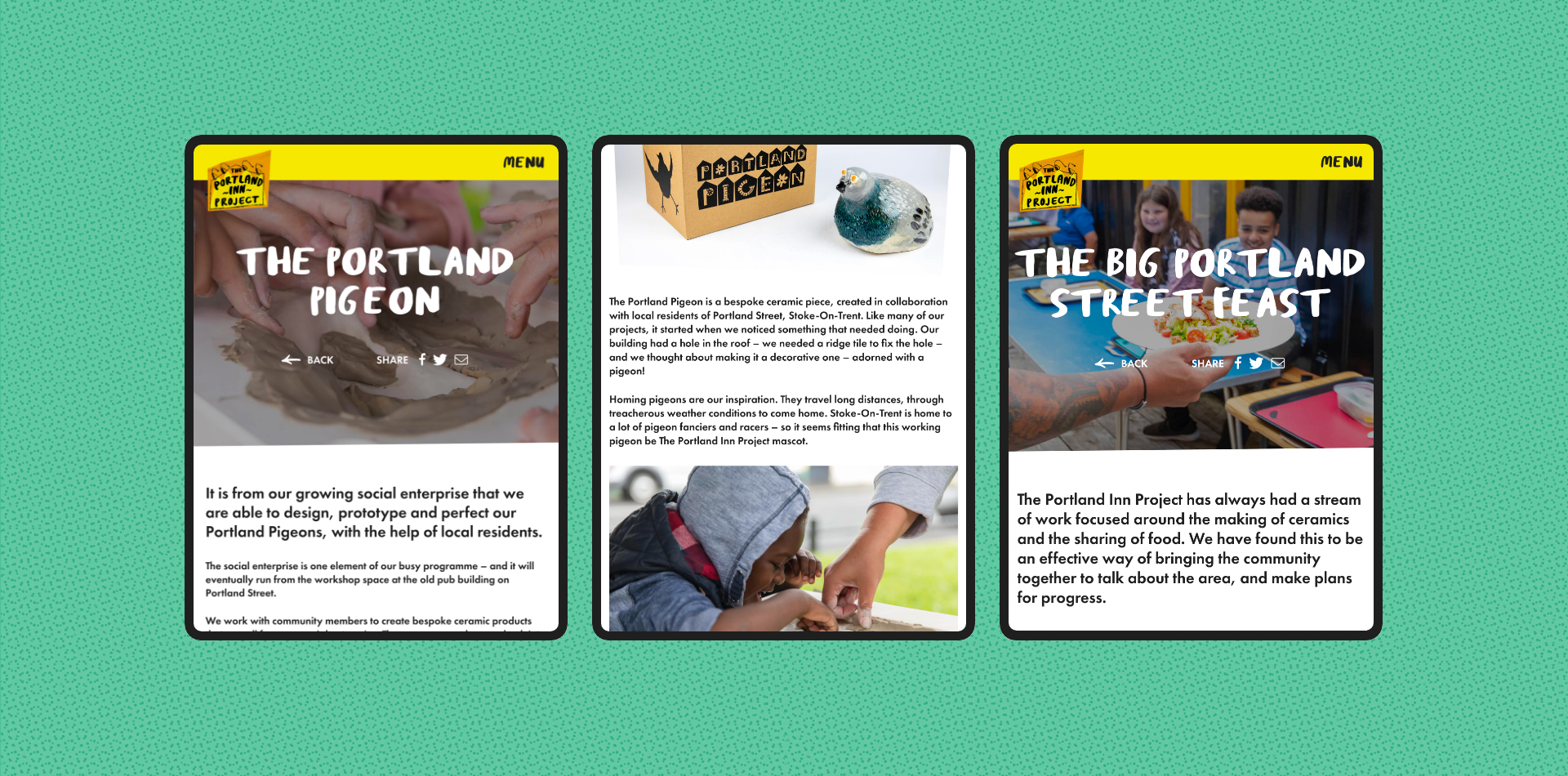
In 2021, I worked with the project to design and manage the development of their first website. The aim was to create an online hub for the program, to host resources that shared learnings and to keep the community up to date with the progress of the building renovation.
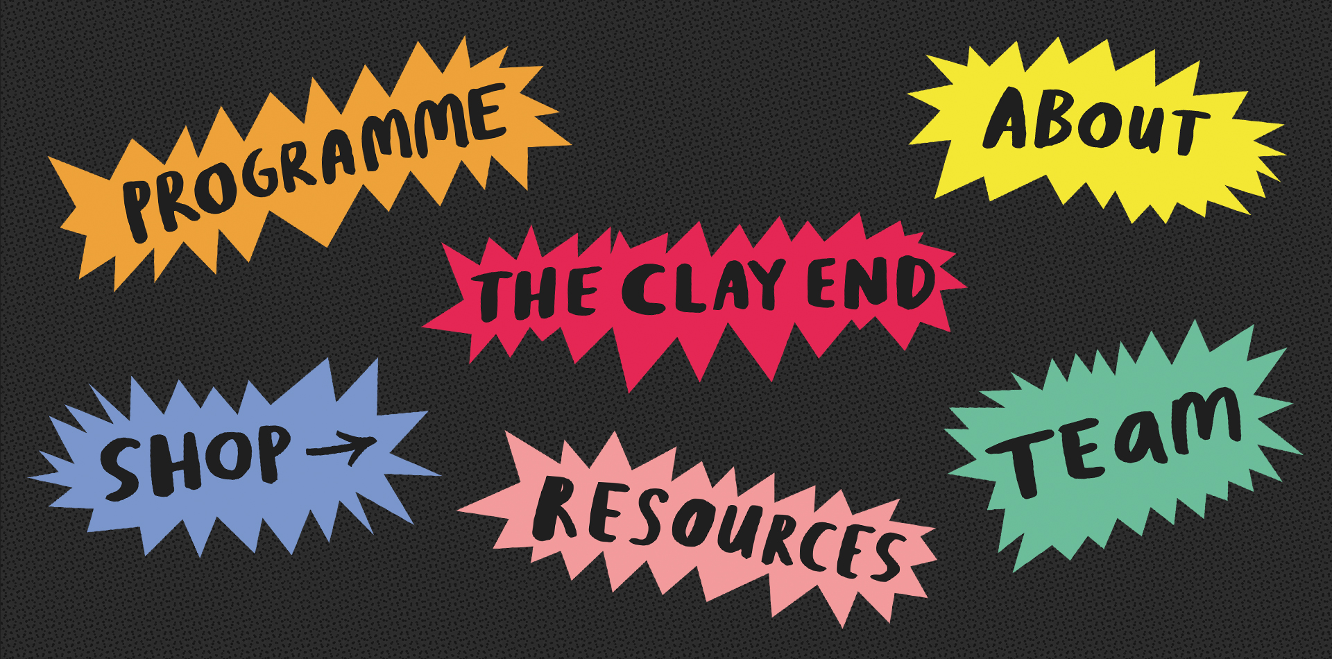
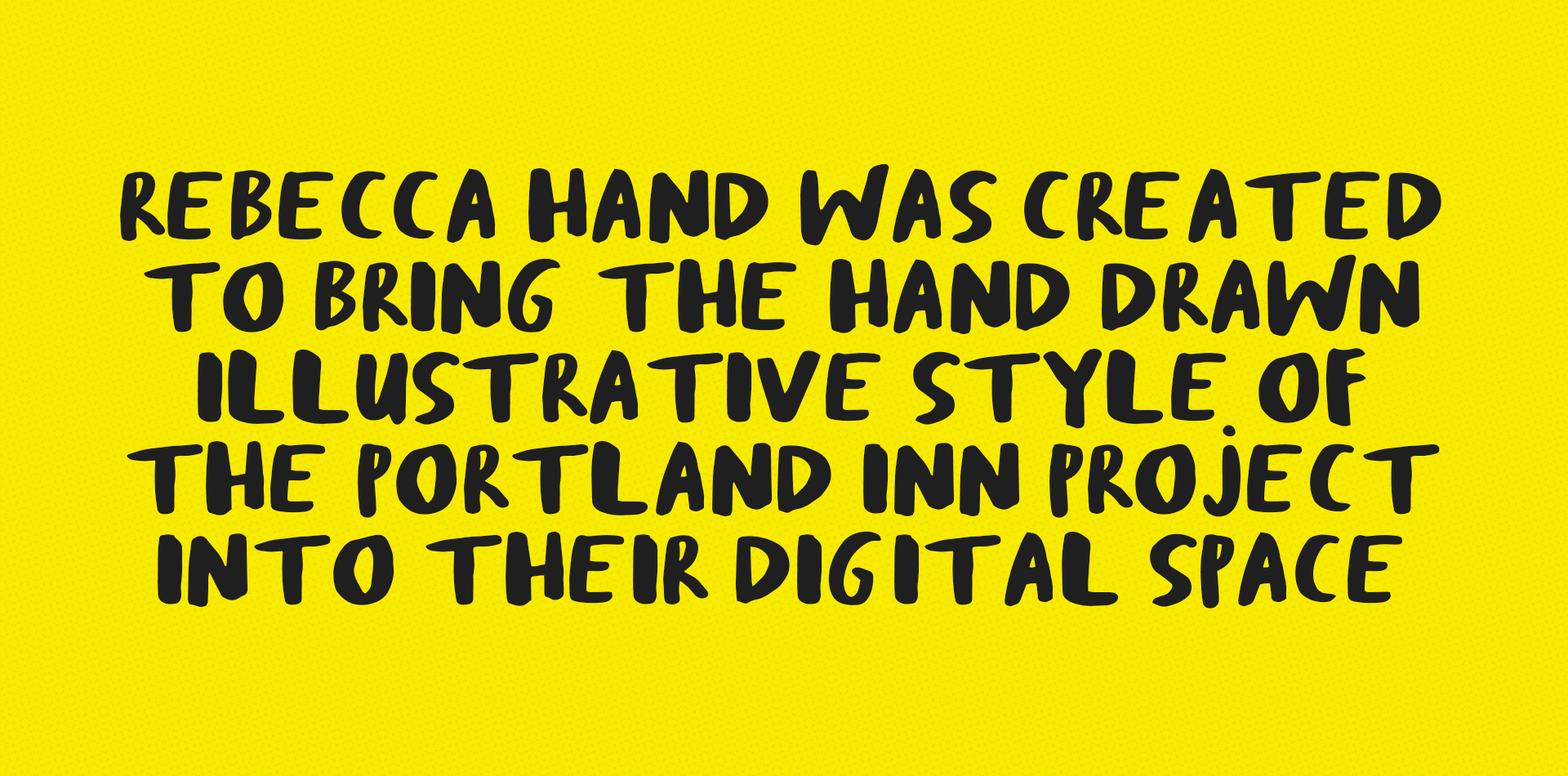
Together, we created a fun and engaging online space using their unique brand style and added elements to make the site more personal to the project. This included using sound bites from its patrons for the homepage buttons on rollover, and customised cut-out of images to give a scrapbook-like aesthetic. Plus we used Rebecca’s handwriting to create a custom typeface, Rebecca Hand, for the website headlines. We built the site to make it as easy as possible for the team to update, and we’ve continued to develop new features across the site since its initial launch.
Website developed by Kodr.
